

Animation Strategies - Blacksmith Environment
- AlmsAni

- Dec 27, 2022
- 17 min read
Updated: Sep 14, 2023
For week 2, I was moved to a different group, due to my initial group being too big. I was quickly brought up to speed by Conor, and informed on the group's goal. Our group chose the blacksmith environment, and the concept was to have it be owned by a dwarf blacksmith. The twist being he's also deeply passionate about cooking, so combines both professions into one. He crafts weapons and cooking utensils. He also both sells weapons, and runs a little eatery.
The plan was to have two main rooms of the emvironment: the dining section, and the blacksmithing section. The main centrepiece of the environment would be the furnace itself - as the group áwanted to take a Ghibli-inspired direction with it by incorporating a sea-creature design into it. There were already some inspiration sources such as Breath of the Wild, studio Ghibli, and MediEvil's 2019 remake. As I'm super familiar with the latter, it allowed us to decide on that as our main inspiration for the art style of our assets.
I spent the class looking at concept art from the 2019 remake:
Key features I picked up from looking at the work, (and how it translated into the game models themselves) was how proportions were exaggerated. Not chaotic in its cartoonishness, but instead what I like to call "diet Tim Burton". The original game was inspired by the works of Tim Burton and Danny Elfman to begin with, and its evident in the final product. I characterise the MediEvil 2019 style as "blotchy" with its textures. Not quite painterly, as strokes cant really be seen in the final textures, but the colours aren't 100% flat throughout either. I also observed that, particularly on metallic materials, models have a lighter colour around their edges, acting as a highlight.
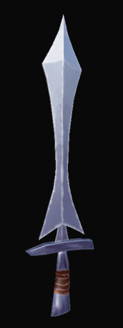
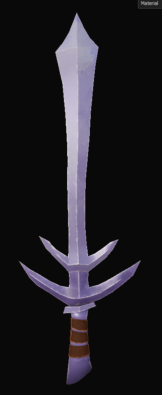
After studying the style more, I got to sketching out some rough weaponty concepts. The idea was naturally to have weapons the blacksmith made scattered around the smithing room - including a wall of "easter egg" weaponry; each of us in the group would model their own special weapon for this rack, each referencing a preexisting weapon from a piece of media that we like.

Following the sketches, I took one, (the scythe) and attempted to fully render it in a style similar to the MediEvil 2019 concept art. It was something out of my comfort zone, but despite being a little tricky at first, I ended up really loving the result.

WEEK 3
week 3-4 - concepts, scythe, knightly sword, rack, style guide
Over the next week, I volunteered to create a style guide for the group. As the one with most experience with the MediEvil style, and knowledge on the right terminology needed to outline what elements of a given style we're using to fuel our own, I was eager to take up the task. I thought the strongest way to convey the differences between a photo-realistic style and the stylised one we were aiming for, would be to take a realistic model, and compare it to a model of the same object that instead follows the guidelines I'll be outlining for our own style.
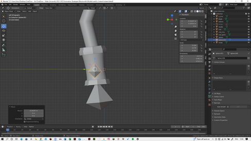
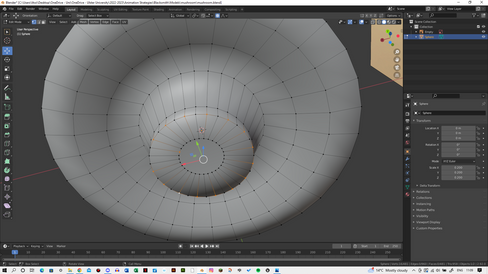
I decided to use the scythe concept for the test model, as it was the sole concept I'd done a rendered depiction of. The cylinder and attachment piece were both created using cylinders; the blade itself was made from a plane that I extruded and adjusted to my liking. The fun part came with the texturing itself. Figuring out how to achieve a blotched effect was really fun - it just came down to having a black mask with a dripping rust generator and blur scope filter applied. For edge highlights I used the metal edge generator with a blur scope filter. As the early few models didn't have great UVs, I would alternate between metal edge, mask builder, or curvature. Once I'd learnt how to UV efficiently and had went back over the previous models, I was able to refine the edge highlights. Using the UV border distance generator enabled this process to be much more effective.
I followed a tutorial to achieve a basic stylised wood texture, before editing it myself to the desired effect. It was mainly achieved by using grunge dot textures and applying a directional blur on them. I'd then toy about with the height levels in order to achieve a wood grain effect. Following this, I used a mask builder with the blur filter to create a thicker, more blurred edge highlight.

After I'd created this test asset, I began writing up the style guide. I looked at existing examples to help me see how to organise my own, and what kind of language was used. I started the style guide off by outlining the general style we were aiming for. I used the term "diluted Tim Burton" to describe ours as whilst MediEvil was heavily inspired by the works of Tim Burton, it can be observed that the edges and proportions in MediEvil 2019 aren't as harsh or sharp - not as overtly gothic. In the same sense, the MediEvil 2019 style isn't overtly cartoonish and exaggerated either. Its by no means realistic, but is neither comparable to the levels of cartoonishness that styles like rubberhouse would show. Following this, I outlined a step-by-step texturing guide using SUbstance Painter. I outlined the methods I'd used for the test asset, including the layer types, generators and filters used. I concluded the guide with a side-by-side of a photo-realistic scythe model with the one I'd made, to highlight the differences. I additionally included other examples of MediEvil 2019 concept art that really exemplified the style we were aiming for.

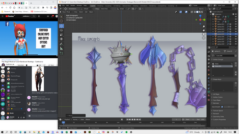
My next task to complete for the next week was conceptual art for the following items:
Weapons rack
Fuller tool
Knightly sword
Bastard sword
Axe
Morning star
Mace
Zweihander
Great sword
While I wanted to have detailed and coloured concepts, I knew aiming for fully rendered concepts, (like the scythe made earlier) would be too time-consuming. Instead, I kept my concept style to rough but detailed sketches, base colours, and some basic shading and highlights.
For the first few concepts, I wanted to include nautical details where I could, since they were already being included in the axolotl/catfish furnace itself. I was later told that it wasn't going to be such a key theme, so the later concepts don't have any of these nautical elements incorporated. I paid attention to the MediEvil 2019 concept art, to see how proportions and colours were exaggerated. With the swords, it became a little challenging to create concepts that weren't too similar to each other, but I believe they ended up being distinctive enough. The axe and morning star concepts in particular were really enjoyable to play about with - my favourite out of all the concepts being the morning star concept with the handle that resembles an arm and hand.
I asked the other group members to vote on which concept for each weapon they preferred, but I ended up having to choose myself.
With the concepts decided upon, I began working down through the list of weapon assets I'd been assigned to.


WEEK 5
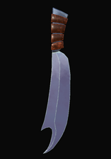
For the knives, the process was simpler than I'd imagined it would be. I simply took a plane, then used the poly build tool to form the shape I'd created in the concept art. I then repeated this process for each of the 6 knives. Next, I selected the faces that formed the handles of each knife, and separated them by selection. Using the solidify modifiers, I then gave the blades and handles the appropriate thicknesses. The wraps were created with the same process that I'd used for the weaponry thus far.


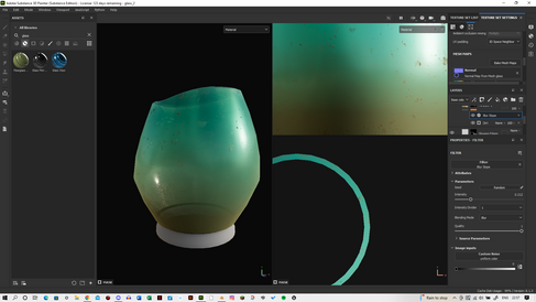
The jars were really simple to model - just two cylinders for the base and the lid, a cylinder for the handle, and a torus for the rim of the lid. I imported the nuts/screws I'd created for the weapons rack to use as attachments for the handle, too. I made use of the bevel modifiers to keep the edges on the body of the jar a little softer. The process for creating the second jar was just a matter of altering the model of the first jar to match the concept art for the second. For the texturing, I took the smart materials I'd used for the knives and just adjusted them to my liking. I darkened the colours to match the concepts, and added a rust effect. This was achieved by using a dripping rust generator on a dark burgundy fill layer. I played about with the settings - including the height levels - before adding the blur scope filter. I also added a position generator on a fill layer of the same colour as before, so to create a sort of burnt effect on the bottom of the jars - to mimic how pots and pans get burnt after prolonged periods of being over an open stove flame. I was super pleased with the overall effect, and saved it as a smart material for later use.


The pot involved a similar sort of process to the jars; cylinders for the base and lid - this time with the edges along the top extruded to create a knob for the lid itself. I used a plane with the poly build tool and a solidify modifier to create the handle. Initially, I tried booleaning a cylinder with the handle to create the hole of the handle, but this messed with the topology in a way that confused me. Instead, I just altered the faces of the handle itself until I got the effect I wanted. Additionally, I used two toruses to create the loops that I'd added as details in the concepts. The texturing was just a matter of using the smart material that i'd created from the jar textures. I simply altered the settings of each layer to suit the pot, and that was that.


The kettle was also quite similar to model. The main differences was creating the spout of the kettle, and the handle with its wraps. The spout was a simple matter of extruding edge loops in the desired area. To create the wrapes, I created edge loops on the handle, then selected the faces that would form the wraps. I then separated by selection and used a solidify modifier. To create the little knob at the top of the lid, I simply used an icosphere. I used the jar smart materials for texturing, as well as the smart material I'd created for the wraps I used with the axe's textures.


Most of the components that were needed to model the cauldron were mostly just cylinder meshes. The base cauldron, the rim, the hook, the pole and the top component were all made from cylinder meshes - the handles and top attachment, however, are both made of toruses. I initially tried to model the jagged metal attachment as seen in the concept, but it proved a little difficult to model neatly, and overall wasn't necessary to the entire model. Texturing, again, was just a matter of applying smart materials.


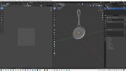
The spoons were both really simple to create. I started off with the heart-shaped spoon. The spoon itself was just a plane with loop cuts and altered vertices. Before solidifying it with a modifier, I created and duplicated a bunch of cylinders in a pattern to create the holes of the spoon. I used the boolean modifier to cut the hole shapes into the spoon, then used the solidify modifier to add the thickness needed for the spoon. To create the dip in the spoon itself, I selected a vertice before moving it with the "proportional editing objects" setting on. The handle was just a matter of a solidified plane after being edited with the poly build tool. A cylinder was then booleaned with the handle to create its hole. For the second, circular spoon, the spoon itself was just a modified cylinder: modified to create a slight rim. The holes itself were also booleaned in different positions. Texturing, again, was just a matter of applying the jar smart materials and editing to suit. The edge highlights were a bit scuffed around the hole areas of the handle, but I was able to work around this.


WEEK 7:

I had so much fun with this asset in particular. Perhaps it was the different colour palette compared to the previous models, but overall it was a blast. Most components of the model were made with cylinders or toruses. Spheres were used for the diamonds and the teardrop-shaped gems. The blade was made of planes, again with a solidify modifier. The texturing process was really refreshing, again probably due to the different colours involved. I refined the wooden smart material I'd used from the scythe test, as I found better ways to achieve the look I wanted through the techniques I'd picked up during the course of modelling the previous assets. Overall, I think this is my favourite model so far out of any I've made. It came out just as I'd envisioned it, and truly feels like it was plucked from the concept art.


The next concepts I set my sights on completing were for the drinking glasses, plates, and for the broom. I decided to conceptualise 3 designs for both the glasses and plates, with the intent to model each one this time. I wanted to incorporate nautical design elements this time around for flare. Additionally, I took inspiration from old Greek dishes for the plate concepts.
For the broom, I really wanted to push the bendiness of the staff, and play with some unconventional colours for the bristles. I ended up choosing the far left concept for these reasons.


DO


Next, I wanted to quickly churn out some food concepts for the eating/kitchen areas. Other members in the group had already created some to begin with - in particular for a basket of mushrooms and for a meat roast. After researching typical medieval ingredients and dishes, I decided to create the below concepts:


For the papers with recipes on them, I started off with 6 variations of a plane in Blender. I then took the images I found of genuine medieval recipes and used them as mask layers. I made the base colour of the text a deep burgundy, and slightly lowered the height levels, to mimic how pencils and such create indents in paper. I followed the usual texturing process of having a base colour layer, with a "blotch" layer on top in a slightly darker shade. However, the ripped edges and crinkles of the paper that I wanted to achieve posed a new challenge. I followed the below tutorial to find out how to go about the effects I wanted. I was able to fully take advantage of opacity settings and achieved the results I wanted after playing about with the settings for a bit.
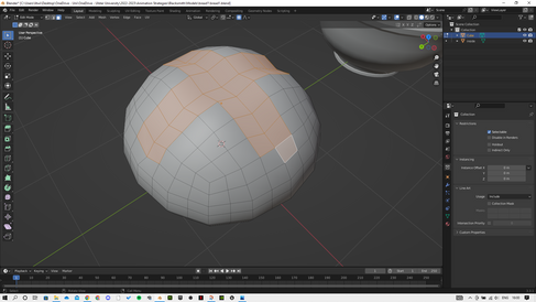
The creation of the bowls was a really simple process: just a matter of adding edge loops to a cylinder and removing the top face. For each variation of the three bowls, I just played with the shape of the rim by moving around vertices. I wanted a wooden bowl, a marble bowl, and a clay bowl - so this meant the texturing processes would differ. For the marble bowl, I used some of the built-in textures such as bnw spots, marble veins, and grunge dirt. I fiddled about with the settings until it looked right, and made sure to keep the roughness levels a little on the lower side to reflect how slightly reflective polished marble is. The clay bowl was simple: I kept roughness levels higher than that of the marble bowl, and just used varying dirt generators. Finally, the wooden bowl was a simple process of changing the settings after applying the wooden smart material I'd made. I really love how the bowls turned out! It really showed me how textures can make what's ultimately 3 of the same model look so different.


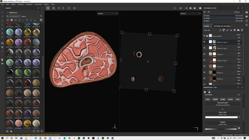
Modelling the stew seemed daunting to begin with, as not only was it vastly different to any models I'd made thus far, there weren't many examples in MediEvil 2019 for me to look to to base thus model on. The bowl itself was as simple as following the same process that I'd used to create the preexisting bowls. The only difference being that I duplicated and separated some of the inner faces, before filling the vertices at the top - this created the broth for the stew. The meat cubes were inspired largely by this minigame in Super Mario Party (Switch) where you use gyro-controls to flip a cube of meat:


For whatever reason, this example stuck in my head and served as the reference for the meat cubes. Modelling them was a simple matter of subdividing a cube mesh a bunch, and then messing around with vertices until it was overall less uniform. The carrots were just simple cylinders scaled down appropriately, and the potatoes followed a similar process to the meat cubes, just with a sphere instead of a cube. Texturing the model seemed daunting as it wasn't as simple as just applying a metal smart material of my creation, but as it turned out: it was the most fun I'd had with a model, next to the Zarok trident. The meat fibres were created by using an "anisotropic noise" fill layer with the directional blur filter applied, and adjustments made to the height and colour settings. This layer was duplicated again to add some varation. For the rarer sides of the meat, a dirt generator was applied to a fill layer, as well as the blur scope filter. The edge highlights followed the same process as the hard-surface assets had. And the charred bits on top were created by using a fill layer with a light generator applied with both the blur scope and blur directional filters. The carrots followed a different process of using alpha textures to create the inner ring shapes of the carrot slices, all with very slight blur scope filters applied. The "grunge rusty leaks" texture was used to create some bumps/ridges on the slices, and a position generator was used on a separate fill layer to add a gradient. The edge highlights were the same process as usual. I additionally added a water droplets smart material to add the appearance of the wetness caused by the surrounding broth. The potatoes followed a similar process, just altered to suit the different colours and such. Overall, I made sure to keep roughness levels low all around as the broth liquid would naturally add a glossy appearance to the ingedients. I absolutely love this model, and honestly its a shame its not a centrepiece, as I'm immensely proud of it. It really pushed my texturing abilities, and proved to myself I'm capable of achieving details in unconventional manners.


Much like the stew, the roast also turned out to be one of my favourite models so far. I was initially a little nervous about approaching the task, as it was such a far cry from the hard-surface modelling I'd been doing. But equally, I was really excited to try my hand at it. Thankfully, the process of modelling was very easy. I started of with a cylinder for the meat, and subdivided it a few times. I moved around vertices and altered the scales of edge loops in order to create the cartoonish style of meat that doesn't really exist in real life. I selected a good few of the top faces and separated them by selection after duplicating. I then used the solidify modifier to add thickness. Going back to the original base cylinder, I divided it into several pieces to mimic the separate muscle sections present in cuts of meat. This left me with the segments, and an outer cylinder encasing them - this would act as the skin for the meat. The bone was just another cylinder, just with less vertices to give a blockier appearance. Texturing the mesh was super fun and experiemental, it turned out. I was considering just taking an image texture of meat tissue from online, but through fiddling about with Substance Painter's built-in textures, I was able to create something really appealing on my own. The muscle segments were the most interesting to me: I took the plasma texture and applied it as a fill layer, before using a blu scope filter, and also a highpass filter. I fully don't understand what that latter filter does, but it produced a really nice effect so I stuck with it. I also used a fill layer of the anisotropic radial texture with some height adjustments to create the finer sinew lines. The same texture was also used for the skin and the top rind to create the same sort of lines. I also grabbed a criss-cross png to use as a mask layer for the rind. With some height adjustments, it created the scorred pattern on the rind. I duplicated this texture, but removed the height settings, and instead gave it a lighter colour and a more intense blur scope filter, so to mimic the edge highlights of the rest of the rind. Elements like the bone and its marrow followed the basic fill layer, blotchy layer, edge highlight process - just with an additional position generator to add a gradient. Overall, I adore this model too. These last two models have really shown me just how much detail can be achieved with texturing alone, and honestly might inspire a hobby of modelling food assets pff.


The plates were all super simple to create - all started off with simple planes. I would then just asubdivide and move about vertices where needed to match the concept art


WEEK 8:
The first model I worked on this week was the broom. Most of the model itself was relatively simple; a cylinder for the staff, and one for the handle at the top. Just another process of creating loop cuts where necessary and messing with the vertices. The rope loops around the bristles were craeted using toruses. The bristles themselves, however, I initially planned to be curves converted to meshes, but halfway through the process, I realised I could achieve a lot of the finer details that I'd wanted to just through texturing. So I ended up with a singular curve->mesh as the main group of bristles. I did end up creating a few singular bristles with the curve to mesh method just to give the broom a more "used" appearance. For texturing the bristles, I downloaded an image of broom fibres. I used the texture as a mask layer before editing the height levels and applying both bevel and warp filters to it. I followed the usual texturing method otherwise, as well as adding a dirt generator on a separate layer. The metal handle was as simple as just applying my metal smart material, and the wooden one was applied to the staff. Although, around the area where I'd booloeaned a hole into the staff, the edge highlights looked a bit wonky. Nothing major though. Another issue was the behind of the bristles showed an allignment issue with the textures, but as this part of the broom wouldn't be seen, it wasn't a big deal either. For the bottom of the brush, I used a dirt layer just with edited height levels.


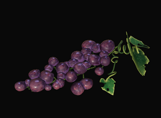
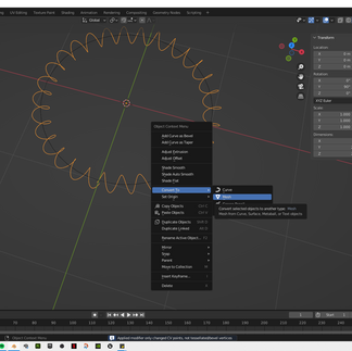
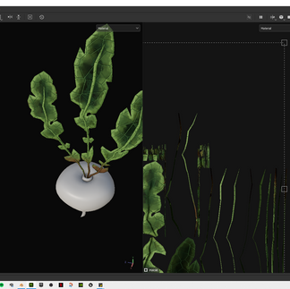
The grapes were next, and were more difficult than they looked. I knew from the get-go that I didn't want to duplicate a bunch of spheres and individually place them on a stem with various branching parts, so I aimed to follow a tutorial that would show me how to procedurally generate the grapes in a sense. Following the below video, I was able to create the grapes using a particle system. It was a little difficult to set up the stem using curves, then have the particle system adhere to that, but I believe it worked out in the end. The only issue came with me converting the particle system into a mesh. I discovered during the UV stages that this left me with dozens and dozens of small grapes with their own individual faces and thus, individual UV islands. The leaves were just a matter of altering and subdividing a plane to match a leaf reference, then shifting vertices to create the curves in the leaf. The vine itself was created by coverting a spiral curve into a mesh after editing. Texturing was a little trickier than most models, as the grapes' many small UV islands took up quite a lot of space on the UV maps. The grapes themselves were also trickier due to having no real edges to create highlights with. In the end, I used various layers and generators to create details such as gradients, speckles, and that dust-sorta layer that grapes tend to have. For the vines, I used an anisotropic noise texture to create the grooves and lines, as well as various UV map generators to create subtle edge highlights and gradients. The same gradients were used for the leaves themselves, as well a leaf texture I grabbed from online as a mask layer with height adjustments so to create the leaves' veins.


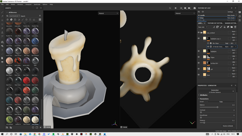
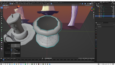
Next up was creating concepts for some candles. I knew right away that I wanted a short candle with an old-fashioned handle, a slightly taller candle with a simple candleabra, and a plain, tall candle by itself. Using medieval candles as references, I was able to create the below concepts. I loved them all too much to just decide on one, so I opted to modelling all 3.


WEEK 9:


WEEKS 10+:


After what felt like years of dealing with lighting issues, I finally was able to move on to creating the shots needed for the diorama. I knew roughly what shots I wanted to render in my head, and once I had the camera controls refreshed in my mind, getting through them was a breeze. Especially compared to the lighting issues.
After exporting all the sequences, I took them into After Effects. I imported the image sequences individually before rendering each as their own mp4 files. I then brought said files into a new project so I could add fade-in effects to where I wanted. It also ocurred to me when playing back the sequences that the shots and low quality lighting reminded me of the FMB intro cutscene to the original MediEvil:
(Begins at 1:23)
The swooping shots of Zarok's room in particular were what I found similar to my own sequences. So I figured I'd embrace this similarity to add flair to my diorama. I applied the cartoon effect in After Effects and played around with the settings until it resembled a more low-res effect - something similar to old PS1/Windows graphics. I then added in some music, aka Run of the Hill from MediEvil 2019. Unsurprisingly.
Despite the immense struggle that the errors I ran into with the lighting caused, I find the end result of my diorama rough but charming. It came as a slight disappointment to have it submitted so late, however, as I know I put my all into the assets themselves, and setting up a lively environment with them. I had a great time largely taking the role of art direction, and the whole experience really pushed my modelling and texturing abilities - even within the space of the first month. I'm so proud of so many of the models I made, its just a shame I underestimated how tricky Unreal would end up being. In the end, I still like the diorama itself. Its corny in a good way, and shows me I'm capable of more 3D work than I previously thought.
Comments