Week 2: Composition and Perspective
- AlmsAni

- Oct 9, 2020
- 5 min read
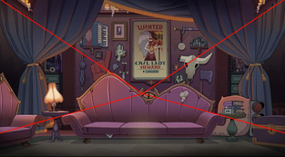
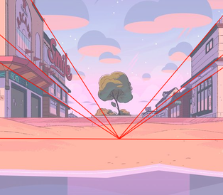
For preparation for week 2, our first bit of homework was to take 3 backgrounds from media we love, and trace the perspective lines over them:
This was surprisingly challenging! Despite how simple it seemed, for some reason the differences between one point and two point perspective were initially hard for me to grasp, and that can be seen with the first image. Upon rewatching the provided resources, and searching for more examples, it started to make more sense, (which the second image hopefully shows... ;w;). Through researching particularly on two point perspective, it helped with my understanding on how to construct my own backgrounds. I thoroughly enjoyed observing the different styles present in each background, (The Owl House, Steven Universe, The Owl House... again...) The differences in shading, colour palettes, and lighting really have deepened my appreciation for background artists. I discovered through this that I prefer styles that have graphic lining, but painterly shading.
Our next task for homework was to draw 12 thumbnail backgrounds set in our world - focusing primarily on composition and less on detail: (I initially forgot it had to be greyscale, and not in colour - but I included both versions!)
This was definitely an eye opening experience for me as I expected this task to come more naturally to me - I quickly found it did not! It was difficult for me to strike a happy balance between detail and cimplicity all the while with good composition. I wanted to take this task as an oppurtunity to really push the perspectives and do some w h a c k y angles.
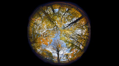
For "Winter #2" and "Autumn", I wanted to try my hand at fish-lens angles (ref images 1, 2) which not only forced me to venture from my comfort zone, but also allowed me to have fun and loose. "Spiderman Into The Spiderverse", (ref image 4) also served as an inspiration through its rich and warm Autumn scenes, with a dash of "Gravity Falls" weirdness. "Village" was heavily inspired by the level entitled, "Wilikin Village" from "Skylanders Giants" - as the level always gave me eerie vibes and discomfort as a kid, what with how empty and grey it was despite the childish and colourful exterior. It was uncomfortably desolate and I wanted to recreate the same feeling for this thumbnail example of what the abandoned villages in our world would be. "Highway" was inspired by one of the "Rainbow Road" tracks on "Mario Kart 8 Deluxe"; I absolutely adore the high up view overlooking the vast and lit up city at night. The break-neck pace that the kart-racing provides when taking place in a fast-paced city provided me with what I wanted this thumbnail to be antithetic too - what with being equally as abandoned as the villages and parking lots. Finally, "Harbour" was greatly influenced by the scenery in Newcastle, and "City #1" took further inspiration from "Spiderman Into The Spiderverse".
Overall, I aimed to have a blend of cliche scenes, (brightly lit, advertisement-central city) alongside cliches that were given a twist, (eg: neon in a snowy morning, desert sand that has been heated up enough to actually crystalise). I also aimed to play around with wacky sky colours, (green/ochre) - although in hindsight, some of these beauties didn't translate into greyscale well :p ... I find it interesting how even eerier and emptier the village became though!

In terms of continuing with developing creature designs, I decided to focus on my favourite concepts I came up with last week: magma bunny, radioactive frog, and highway fox! The bunny peaked my interest the most as I believed it had the strongest concept - this cute, docile bunny cursed to be largely comprised of such a violent, angry force of nature: lava. Ironically, the Pokemon, Scorbunny, only crossed my mind literally after saving the image below as a JPG so... yeah.
When compiling references, I wanted to have a range of rabbits from the more anthropomorphic, to the highly minimalistic, to the actual stock photos. When sketching and breaking down the rabbit form into shapes, I was drawn to the idea of blending a simplified, rounder, bunny body with comically large and contrastingly pointed ears. I also wanted to flip the idea of a standard bunny on its head and wanted to give the lil' guy a sharp and stylised flame tail. I used the same colours from last week's doodle as I found they worked a treat - however, the only colour choice I would change is either making the ash paws a warmer grey to blend better with the rest of the colour palette, or add the already existing grey to more areas, (such as the ear tips, for optimum petting and also the snoot) so it adds a nicer contrast instead of just existing but not adding anything. In future art, I look forward to playing around with the idea of the magma changing colour for certain scenarios, as our new member this week, (Nathan) suggested the idea of emotions affecting the bioluminescent attributes. I imagine the magma becoming more red when this small sir is feeling shy/subdued, and paler yellow or even white when frightened - very much based on the notion of temperature dictating the colour of lava, and how humans tend to heat up, (especially in the face) when experiencing intense emotions. However, the best bit is the name. I mean, come on. I'd like to think the potential child character would name the cuter creatures such as this, purely to avoid the fact I am sadly proud of the name...

I also sketched out a mix of quick studies of real animals, and more creature concepts. I found it tricky making the sadly unnamed fox look like... a fox, as my style always turns foxes into cats, apparently. I always aim for exaggerated ears so to avoid tiny, cat-like ears but ironically this method just causes the opposite effect. Yay. I look foward to fixing this though! I find the unique way to display bioluminescence using the highway theme to be fun! So far, I aimed for sharp triangles to be prevalent in the design, so to translate speed and sharp wits, (as foxes in cartoons are often portrayed as having). I also want to keep the complimentary yellows and purples that I used last week for this guy. The frog was satisfying to doodle, surprisingly! I've never drawn a frog in my life until recently so figuring out the anatomy and how that translates in my styl was interesting! I wanted to focus on cylinders and circles to convey passiveness, alongside the contrastingly sharp diamond eyes and mouth to allude to its dangerous nature. Again, I'm happy with the cyan/magenta/yellow palette I doodled last week so I intend to flesh that out.
It was fun to work with our new members, Nathan and Dayla - their fresh perspectives helped us refine and polish some of the more cluttered concepts from last week. Together, we were able to decide on an agreed story, which before was an undecided casserole of all our ideas. We also finally got around to brainstorming character ideas which really got me excited as character design is my JAM. As someone who has spent the last 2 years ironing out my world I made when I was 12, I can recognise when too many loose ends and contradictory ideas sprout up - so it was good for me to be able to suggest when we should streamline some ideas or get rid of others for the sake of an easily digestable plot. I also brought up the question of what inspired each of us, so we could see where our influences overlap and spot ones that were causing the clashing ideas. Thankfully, we all had been laregly drawing from either sci-fi, environment, apocalypse, or mysterious sources.
To summate, the week saw huge progress for our group!


Comments